The colour balance tool is one of my favourite features of Capture One, and one I get asked about regularly. In this video I show you how to use the colour balance tool (also known as the three way colour corrector) to colour correct a photo.

Thomas is a professional fine art photographer and writer specialising in photography related instructional books as well as travel writing and street photography.
All tagged Colour
The colour balance tool is one of my favourite features of Capture One, and one I get asked about regularly. In this video I show you how to use the colour balance tool (also known as the three way colour corrector) to colour correct a photo.
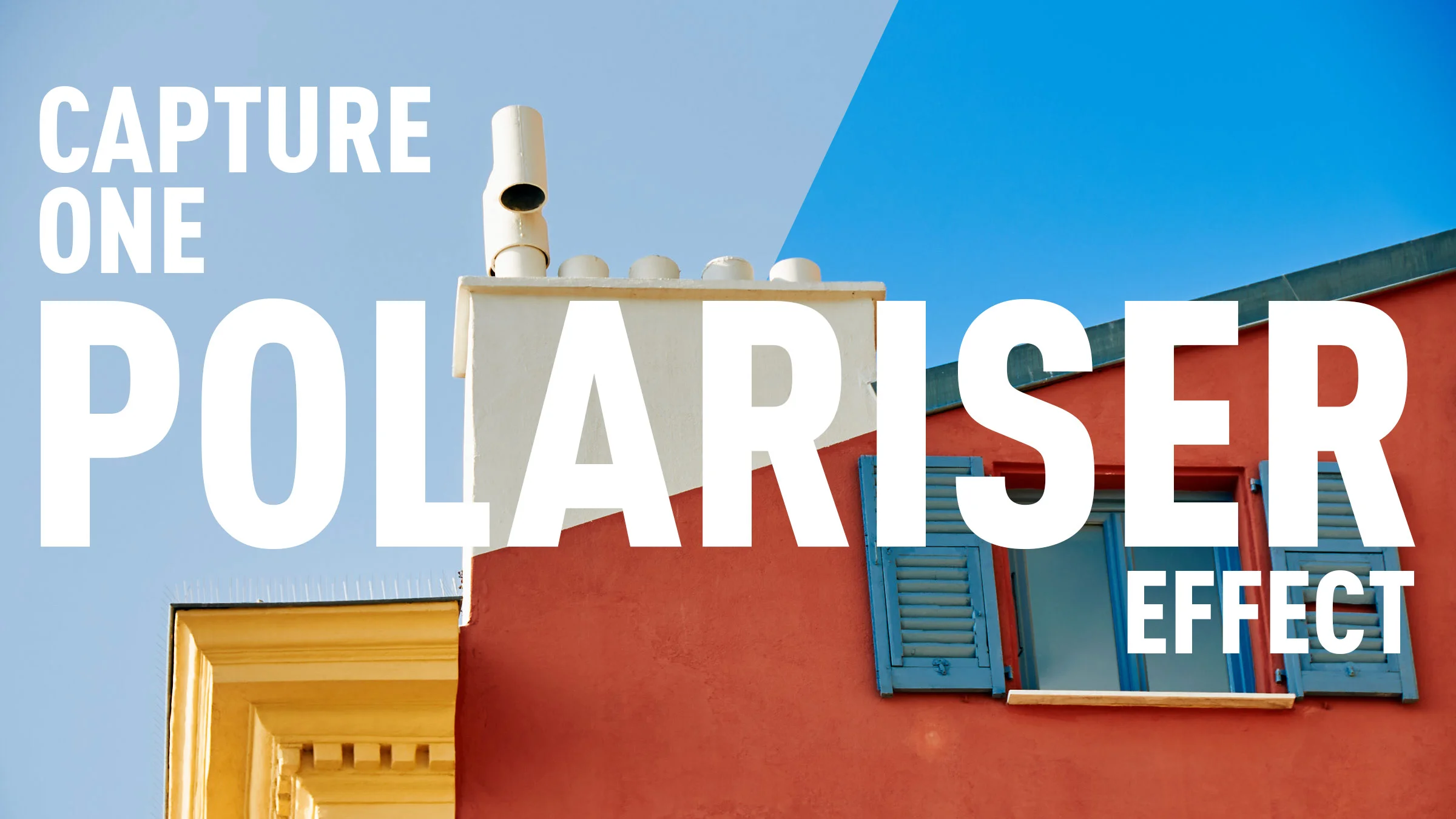
Using a polariser to enhance the blues in your image was probably one of the first filters that I ever used when learning photography. You can also match this effect in software, although you can’t easily replicate a polariser’s other feature which is to cut down on reflections. In Capture One, the obvious way to replicate a polariser is to use the colour editor tool, however, it’s not as straight forward as it seems. In this short video I show you how to create a polariser effect and save it for reuse.
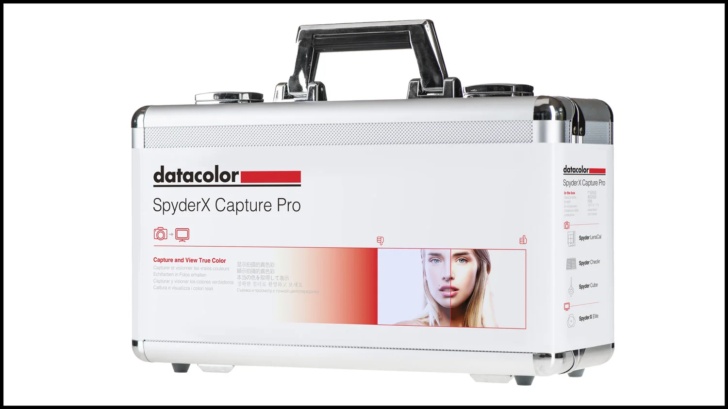
Long time readers will know that I’ve spent quite a bit of time talking about and coming up with solutions to the problem with Adobe’s calibration of Sony raw files. In particular, I’ve covered the A6000 many times, as it is a camera that I own and use regularly. In the past I’ve crated custom corrections by manually adjusting the calibrations by eye. As Datacolor were kind enough to send me their Spyder X Studio package to try and to review, I thought I would see if I could use the Spyderchecker to create a better profile.
I’ve had the Spyder X attached to my computer for over a week now, and for the most part there isn’t much one needs to do. It does continue to work away in the background though, so I wanted to give it some time to see what it was like to be using it over a longer period.
Having worked in both the print, photography and video industries for a long time, I’ve always appreciated the importance of having a properly calibrated display. It can actually make a huge difference, especially if you’re collaborating with others or having you work printed or so on. Over the years I’ve used a variety of calibration tools, and I’ve recently been trying out a new calibration system for my computer, the Datacolor Spyder X.
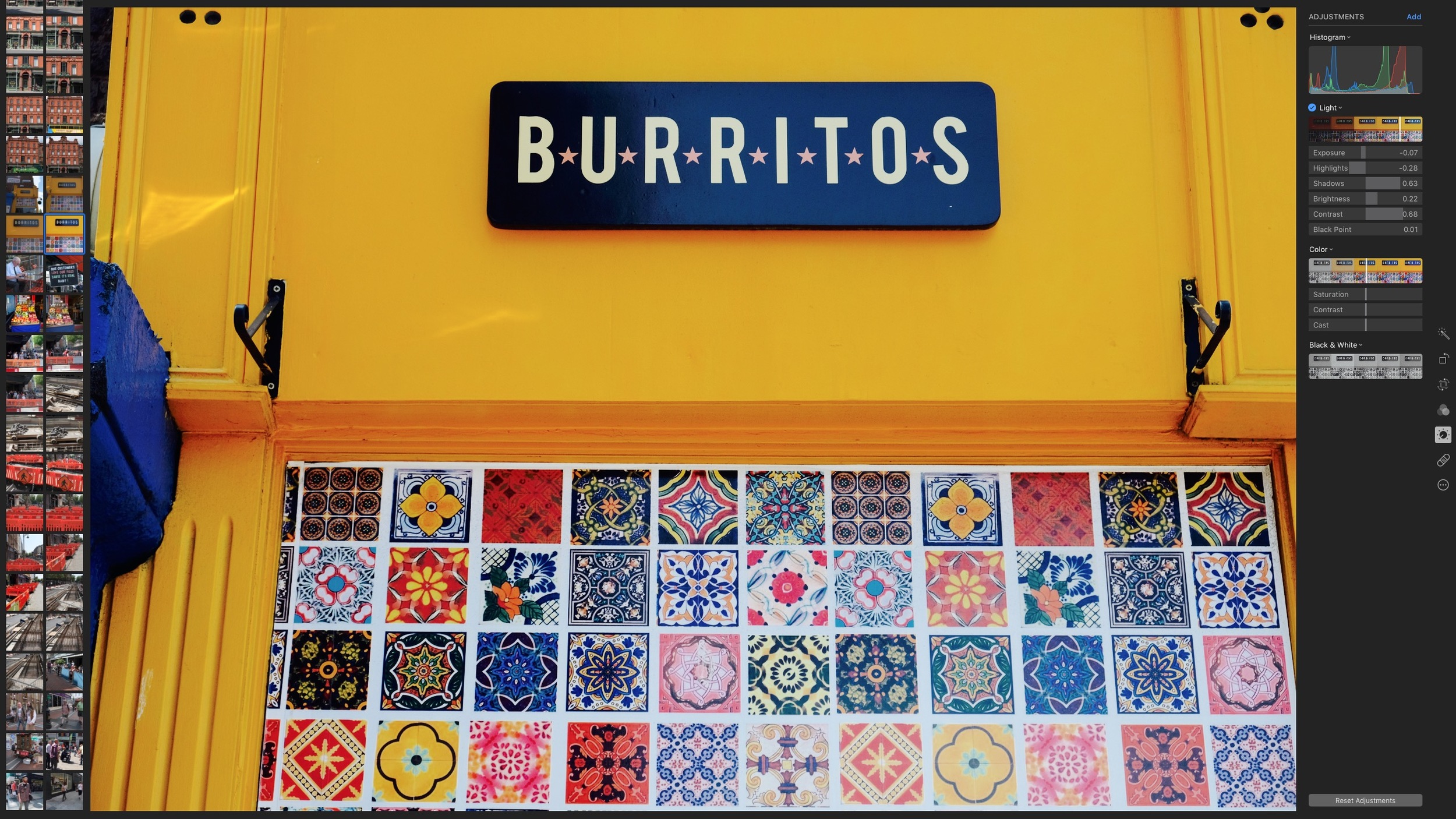
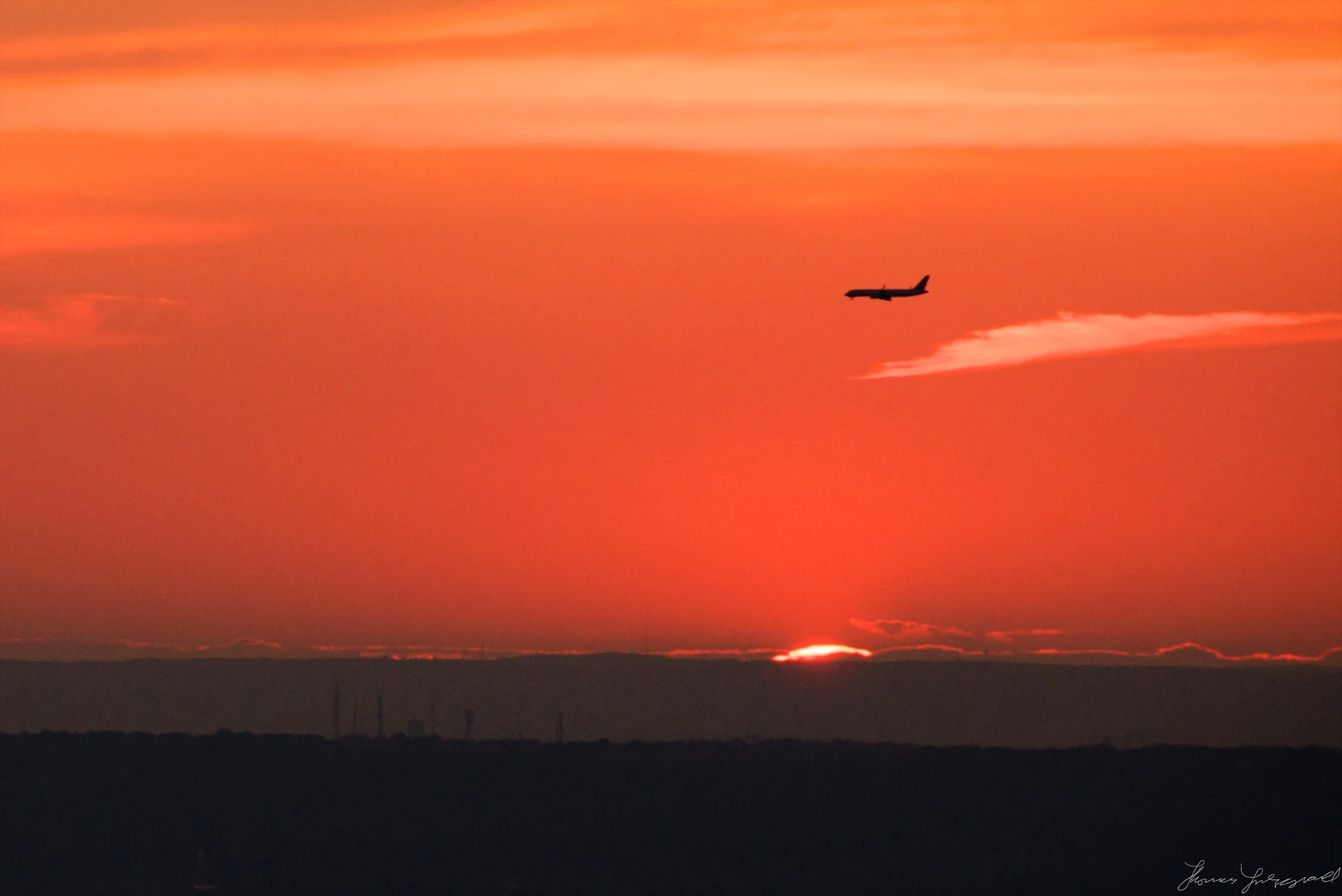
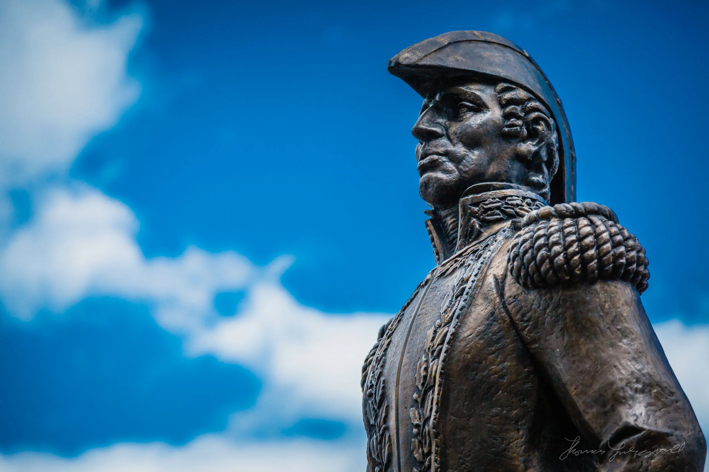
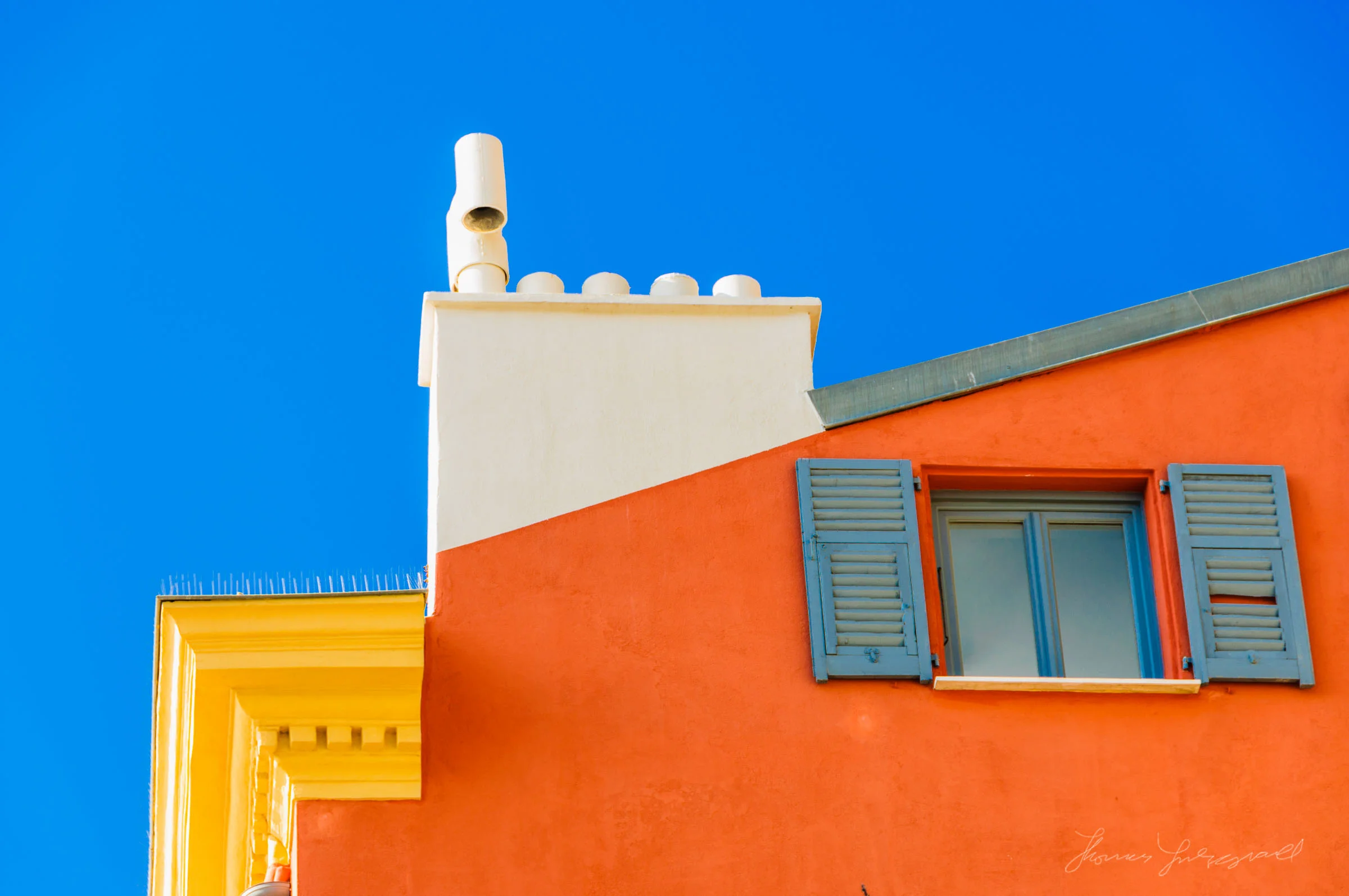
I set myself a little project the other morning, and that was to venture around the streets of Dublin city looking for interesting colours I could see. It’s become something of a running gag now, that my “Street Photography” isn’t technically street photography. But then, the definition of street photography is so vague anyway, at this point it doesn’t really matter. It was an interesting exercise, and it was quite revealing to me.
When Lightroom first came out, one of the biggest complaints that people had, was that the colours would change when importing RAW files. This led to the inclusion of colour profiles, designed to mimic a camera’s various picture modes, and this seems to address the problem. However, as time has gone by and Lightroom has supported more and more cameras, the quality and accuracy of the included colour profiles have started to vary significantly. If you find that, even with selecting a colour profile that matches what you shot in camera, the colours are still quite a bit off, then this trick may help you resolve the problem.
Apple's Photos App on the Mac (and iOS) has some interesting and unorthodox tools for adjusting your images. The Light and Colour sliders are interesting ways to alter your photos, and even on their own, the smart algorithms which adjust the individual parameters of a collection of adjustments, can often lead to interesting results. If you want more control however, you can tweak the individual parameters in the Light and Colour section separately. In this short post we're going to take a look at the controls in the Colour adjustment group.
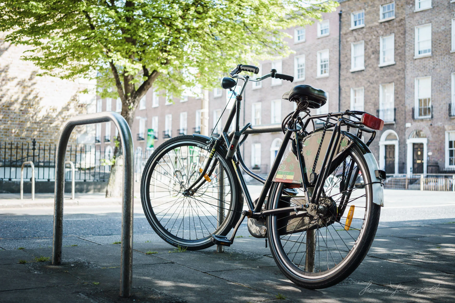
One of my absolutely favourite places in Dublin City is on the banks of the Grand Canal between Portabello and Mount Street. It is a beautiful stretch of walkway, with leafy green trees and gorgeous benches. I spent a bit of time there recently in the gorgeous summer sunshine and I captured lots of photos of the place.
I’ve been using the little Sony A6000 now for almost a year and it’s a great little camera for the price. One of the things that had been frustrating me however is that I always found that I wasn’t quite satisfied with the look of the raw files when processed in Lightroom. To me, the colours never looked quite right, and so I set about doing something about it. Having shot lots of test shots on multiple cameras for comparison, I’ve developed two approaches to addressing my concerns. First, I tweaked the default white balances, and second, I tweaked the calibration settings in Lightroom to come up with what I believe is a more pleasing look.