I've recently been producing a series of preset packs for Aperture which are available for sale over on my other blog "The aperture Blog". The first two have gone down a treat and I had begun working on a third pack. It's still a work in progress, but I am so happy with the results that I just had to share them. The idea was to create a "vivid" preset. This may sound like it should be a straightforward matter, right? Just push the contrast and saturation up a bit, right? Well, you could certainly do that, but it's a bit more complicated than that. If you just push up the saturation all the detail gets bleached out, and if you just push up the contrast then you can burn out the highlights and loose too much detail in the blacks.
As I was working on it I decided to push it a bit further. I've been doing a lot of reading lately and I've noticed a trend among some photographers to have a richly saturated look that really brings out the colour in images. So, I decided to push my vivid preset even further. After a good bit of experimenting I managed to find the right secret sauce to achieve the result I wanted.
I picked a few images from my library and while I was fine tuning I was applying various iterations. When I was finished, I really liked the look I got. I know some of these might not be the best photos from an artistic or creative point of view, but it does bring out the colour, which was the idea.


These are from the "foliage" version, which I added extra emphasis on the greens to really make them pop.

This is one of my favourite shots of the series. The yellow in the daisies really came out and brought a whole new life to this picture. You can see another shot of these daisies which hasn't been processed on this post, if you want to get an idea of just how far this has brought up the colours.


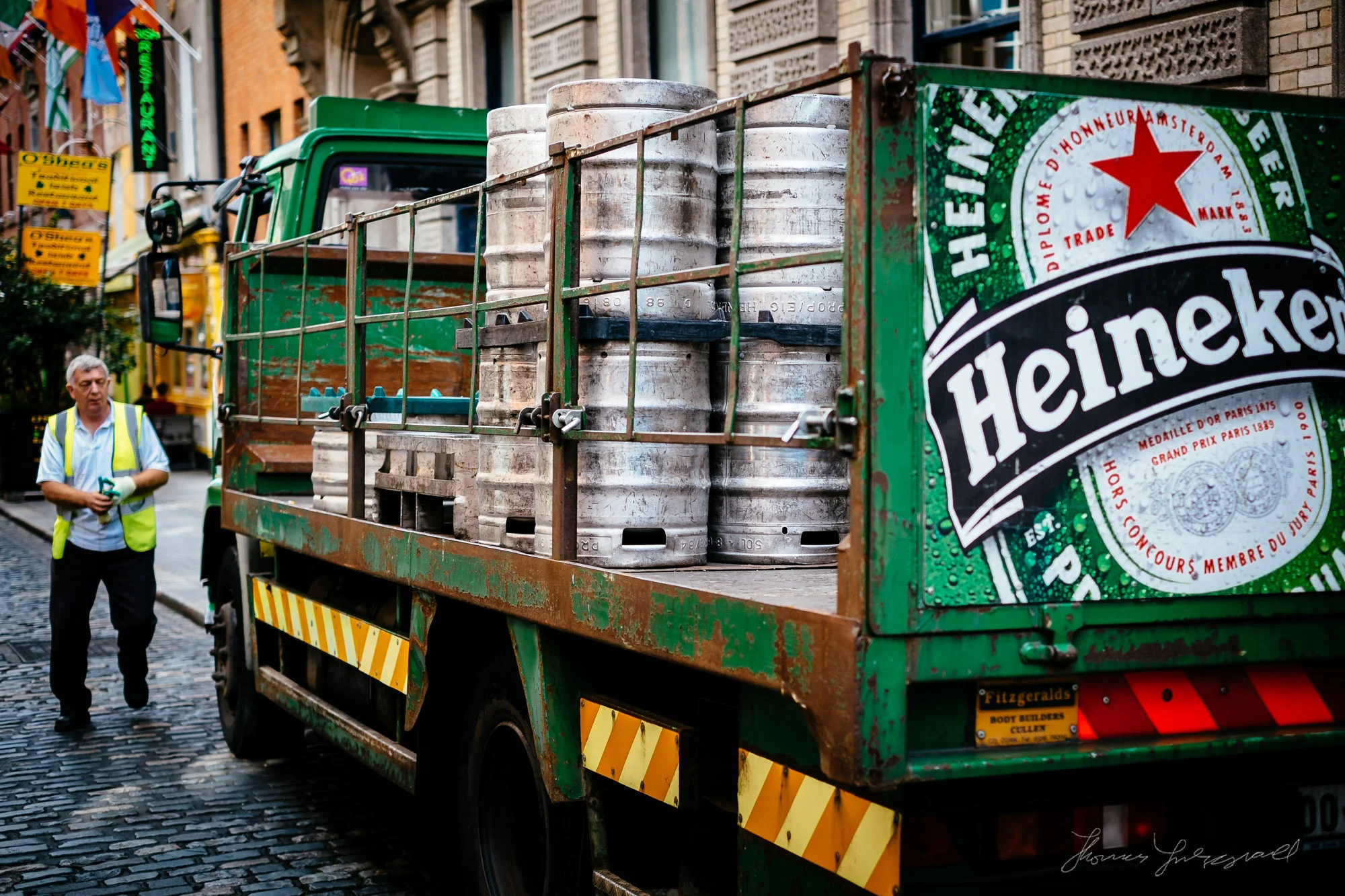
This really brought out the texture in the grate and the sign. The original version of this is really flat and boring.


Obligatory graffiti shot!

I love this shot two. Actually, there's another little anecdote behind this one. It's one of those images that I had remembered taking but somehow it got lost in my library. When I was looking for other shots to test my vivid preset on I found it. It's not safely stored on my online library for safe keeping!

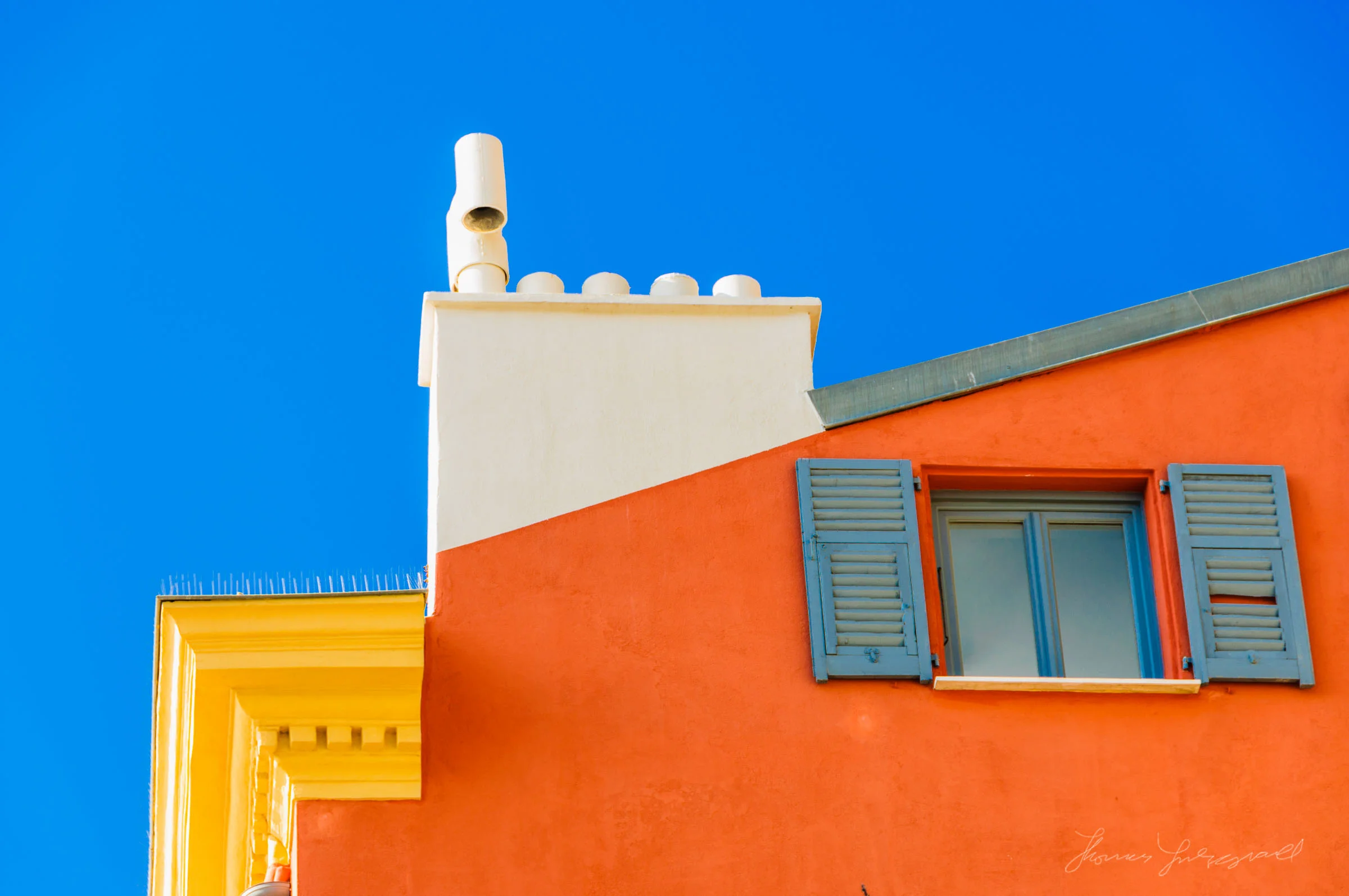
This already had some great texture and colour in it, but now it jumps off the screen at you!

The isn't great shot, I know, but I love the colours. I really like the blue tone of the white and the red in the roof and the wall really contrasts nicely. Of course if I had gotten the focus point right it would be a lot better, but anyway, it serves to illustrate the point.
I know this rich over-saturated look isn't for everyone, but recently it seems to be getting a following. I think the success of the new cameras from Fujifilm, such as the X-Pro1 and the X100 has helped, as their "velvia" presets kind of go in this direction. Actually, it was when reviewing the X10 that I got the idea to try and do this preset.
If you're an Aperture user I should have this available for sale (for a very inexpensive price) on The Aperture Blog later this week, and you can see my other two premium presets here. I'm also going to try and do Lightroom versions of these too, although I'm not sure I'll be able to get the same effect but I'll try and get something as close as possible.