Going Green - How I got the deep greens on a rainy day photoshoot
I recently posted a set of photos on my Photo Journal blog about a recent trip to a local urban farm and stately home here in Dublin. Over on my Patreon feed, one of my supporters commented that I always seemed to get really nice greens on this kinds of images, so I thought I would share a few tricks as to how I go about shooting these kinds of photos.
I do like a nice shade of green, and here in Ireland you certainly have plenty of opportunity for that. I remember a few years ago I was coming home on a flight into Dublin, and looking out the window as we approached the coast I remarked to my wife that there was something very distinctive about the Irish landscape and the particular shade of green here. You don’t really notice it until you’re away from it for a while. I’m sure it’s down to a combination of the light at this latitude, the local foliage and weather conditions. I suddenly understood why they call it the “Emerald Isle”. You knew you were home when you saw that green landscape on the horizon.
Romantic notions of Ireland aside, from a practical point of view there are a few considerations when shooting flowers, or foliage to getting the particular deep greens that I like. Obviously all of this is subjective too. You may actually not like the shade of greens in this shoot at all.
The first is the weather conditions. When I shot these it was a very overcast day, and it was between rain showers. Or as we call it here in Ireland: Summer!
(I’m only joking, we’ve actually had a really good summer this year)
The cloud cover kind of acts like a big soft box and the lighting conditions work well with the foliage to give you nice soft graduations in colour. While you generally need some directional light to bring out more detail, it actually works well if you have a contrast between a hero subject (a flower) and a background of green leaves and stems.
The second most important thing is white balance. I always set my white balance to one of the presets. Coming from the film days, I prefer to set my camera as if I was using film, and this means generally setting it to daylight unless under artificial lights.
In this case you may be wondering why I don’t use cloudy or overcast white balances or even use automatic. The problem with these is that they try to compensate for the lighting conditions and will end up warming the image up too much or giving the shot a yellow tone. You want to embrace the lighting conditions, not fight them, and that’s why I use the “daylight” setting.
Just as an unrelated side point, Ironically, I only ever really use the overcast or cloudy setting on a bright sunny day as it warms the image up even more and captures a more golden light. This only really works on my Canon cameras though. On my Nikon and Sony cameras, when I try this it ends up with a horrible orangey tone that doesn’t look realistic. But it depends on the camera.
When shooting this particular shoot, I was using my Sony A6000 and sigma 30mm f/2.8 lens. The Sony actually has really nice greens, so that helps too. I also shot mostly wide open. In this case it was to use depth as a compositional element, to narrow down the subject and focus the attention. There is a misconception among some photography pundits and “experts” on the internet that composition is only about framing, but there’s so much more to it than that. Colour and depth are part of composing a shot too - but more on that in a future post.
Post processing also helped when getting the deep greens and look of this shoot. I actually didn’t do a huge amount of processing, but a few simple corrections can go a long way. In this case I was using Lightroom, but the same techniques would work in Capture One
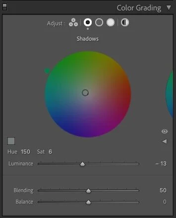
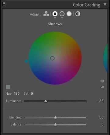
On some images I used the colour grading tool to enhance the greens a bit. I nudged the shadow slider towards the green or turquoise side of the colour wheel. You don’t need much, just a tiny bit. In fact this is the best advice I can give you for using the colour grading tool: Small amounts go a long way. Sometimes, a nudge towards blue can work too. I also used the brightness shadow slider to darken the darker tones. This also worked well to add some (compositional) contrast to the shot and separate the subject. It also deepens the greens.
Finally, on some of the shots I used the individual colour controls to darken the greens and in some cases increase the saturation. I din’t do this a lot, but a few times it kind of needed it.
While not directly related to the green tones in the photos, I also used vignetting a lot to help direct viewer attention. This works best when there is a single subject, like a flower. If the shot is more of a texture or repeating pattern, then less is more when it comes to a vignette.
Summary
So to sum up the key take away points are:
- Dark and rainy weather is your friend
- Set your white balance manually to Daylight
- A few subtle tweaks with the colour grading tool can go a long way.
Of course, there’s one big thing I didn’t really talk about and that’s the subject itself. Without a good subject it’s all kind of a moot point. However, even in a big city you can find lots of interesting nature to take and so, go out and see what you can find.
If you haven’t checked it out already, don’t forget to see the original post that this is based on.
Help Support the Blog
Buy from our affiliates
If you want to help support our blog, you can do so if you buy anything from our affiliate partners:
- Capture One Pro is available in both subscription and perpetual licences available, in versions for all cameras, Fuji specific , Sony specific or Nikon specific. In addition you can get 10% off the price of any Capture One product by using the following code: TFPHOTO
- Capture One Professional Style Kits from Capture One.
- Luminar AI is available from Skylum Software. Get a 10% discount using the following code: TFP10
- Nik Collection from DXO Labs
- DXO Photo Lab
- DXO Pure Raw
- My Amazon Photo Recommendations
- My Favourite Mac Utility Application: Clean My Mac X from MacPaw
- The VPN I use regularly - Nord VPN - Save on 2 year deal (valid at the time of posting)
If you buy through the above links, we get a small commission, which helps run this site.
Check out my Capture One Style Packs
If you’re looking for some Film Effect, or black and White style packs for Capture One, check out my Capture One styles on my Gum Road Store.
Patreon
If you like what you see here and you find this useful, then you can help support this blog and help me keep making great content like this by supporting me on Patreon for as little as $1 a month. There are a number of options available with different rewards, such as behind the scenes content, special Patreon only videos and more. Check out my Patreon Page for more details, and a big thanks to everyone already supporting this blog on Patreon.
Buy me a coffee!
If you’d rather not use Patreon, but still want to say thanks or help, then you can feed my caffeine habit and buy me a coffee via PayPal with a one off donation to my PayPal tip jar.
Join our Facebook Group
If you want to discuss anything you’ve read here on my website, or saw on my youtube channel, or if you want to share images you’ve created using any of my techniques or presets, then I’ve started a new Facebook Group just for that.
Note that this post contains paid affiliate links. We get a small commission for purchases made through these links, which helps run this site.