Reverting to the old tool Tab Layout in Capture One 22 15.3
When Capture One released the latest version (15.3) one of the key “features” was a re-designed layout of the tools and tool tabs. This seems to have been done for consistency with the iPad version of Capture One, but some people may still prefer the old layout. Luckily, you can revert to the old style arrangement of the tools, although there are still some changes. In this post, I’ll show you how to do this.
Make a backup of your current layout first
If you are working with the new layout, and have customised it in any way, then before you switch, make sure to back up your current layout. This applies if you’ve changed anything, including customising the toolbar. I had added the “recipe proofing” and “add to selects” icons to my layout for example. If you don’t back this up by saving your own layout, you’ll loose it when you switch.
To back up your changes, you just need to create your own saved layout. To do this go to Window > Workspaces > Save Workspace. Give the workspace a name and click save.
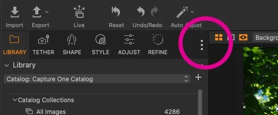
Note, you can also get to the workspaces menu from the pop-up menu on the side of the tool-tab icons on the new tool adjustments layout.
Using the legacy layout
To get back to the old defaults, all you have to do is go to the workspaces menu (either from the Window menu, or the three dot pop-up menu beside the tool tabs) and select “Default Legacy.”
This will put the tool tabs and their combined tools back to the original layout, with a few exceptions. The tools will still default to having the name and icons, and the tool tab names will still use the new naming scheme. For example what was the “Lens” tool tab is now “Shape”.
Finally, you might want to turn off the icon names to make it more like the previous version. To do this, go to the three dot pop-up menu on the side of the tool tabs and select “Icons Only (compact)”. This will toggle off the names and leave you with just the icons.
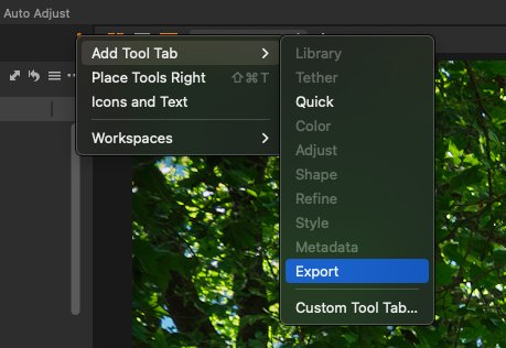
The last thing you may want to do is bring back the export tool tab. Again, who to the pop-up menu and choose the option to add a tool tab, and then select export. This will add back the export tool tab.
If you want you can also customise the tool bar to add in things like recipe proofing, or whatever other customisations you might have had in previous versions.
Finally, you should save this new (old) layout under a new name so you don’t loose any of your customisations.
Conclusion
While, personally I don’t particularly like the new layout, I can kind of understand why they did it. However, going forward, I think it’s probably best to get used to the new default workspace, as it’s going to be the way most future tutorials and other documentation about capture one will be written. But, if it’s driving you mad, then reverting to the old one is completely understandable. It’s just worth making time to get used to the new layout in the future.
Check out my Capture One Style Packs
If you’re looking for some Film Effect, or black and White style packs for Capture One, check out my Capture One styles on my Gum Road Store.
Buy me a coffee!
If you’d rather not use Patreon, but still want to say thanks or help, then you can feed my caffeine habit and buy me a coffee via PayPal with a one off donation to my PayPal tip jar.
Join our Facebook Group
If you want to discuss anything you’ve read here on my website, or saw on my youtube channel, or if you want to share images you’ve created using any of my techniques or presets, then I’ve started a new Facebook Group just for that.


