Opinion: The New Instagram Update is Terrible
So Instagram has been rolling out a new update, and it’s pretty atrocious. If you don’t have it yet, consider yourself lucky. The new design is clearly aimed at competing more directly with TikTok, and while it might be ok for video, it’s really bad for photography and photographic content.
There was something of an ominous warning about the potential changes a short while ago when one of Instagram’s VPs talked about the upcoming support of 9:16 aspect ratio photographs. Much like vertical videos, the platform would be rolling out still images in the same ratio. This caused some consternation online as it’s a difficult aspect to work with in some respects, and while some photographers said they would embrace the change, others weren’t convinced.
Then came the new app layout. Oh boy, where to start.
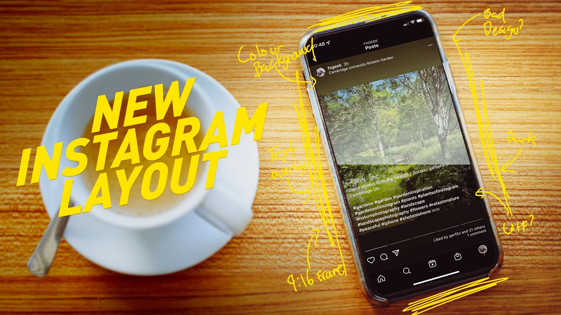
The new layout does away with any breaks between content, and is now a series of 9:16 frames, in one long scrolling succession. The titles, icons and other information are now overlayed on top of the content rather than being underneath it. Photos are now displayed into these 9:16 frames, with bars top and bottom, with the colour derived from the prominent colours of the image. This might not sound so bad, but it’s very clunky looking. The images fitting into frames combined with the overlayed information now means that it’s difficult to see photos clearly without any distractions on top of them, and it looks messy. If you want to read a full caption, you can no longer go the the photos own page and see it separately under the image. Now, the text will scroll up covering the photo completely. This might not even be too bad if they had enabled the talked about 9:16 images, but they haven’t. So now it’s the worst of both worlds.
The old layout, with the text underneath the image and the image clearly defined
The new layout with the text over the image and everything put on a 9:16 frame. It’s not as bad as a still but you can really see it when scrolling.
But it gets even worse.
In order to display the text information over your photos, Instagram is putting a subtle dark gradient overlay over the bottom of images where the text is. This means that they are darkening the bottom half of photos. How bad this looks depends on the image, but if you have a bright or white subject in your photo you will definitely notice it. This is bad form on Instagram’s part. Messing with the content of images likes this shows disdain for photography. While im sure many of you reading this are probably thinking that instagram and photographic integrity never really went together, many photographers these days got their start or big break on instagram. For a while it was the place to get found, but now, I think I can safely say that’s over.
Here you can see the gradient darkening the lower half of the image in order to display the text
The new layout the you view more information, the text that comes up over the image frame, and everything squeezed into a 9:16 frame.
If you’re a photographer on instagram, you might want to start considering what other ways you can find to share your content, because photography in Instagram seems now to be just a legacy feature. I’m guessing that they would kill still image support altogether if they could at this point.
Another thing I’ve noticed, which is not really new with the most recent update, is the amount of video on the platform. This has been growing for a while now, but what I didn’t realise is that some of this is purely because of the algorithm pushing videos more. If you switch to chronological content, you may find that your feed as much more photography in it that if you just leave in on what Instagram wants to show you. This is definitely the case on my account anyway.
All of this is obviously aimed at Tiktok. The folks at Meta are clearly not happy about the rise of the platform. They seem to think that they can compete by somehow turning Instagram into a poor clone of TikTok while at the same time, pissing off the millions of instagram users who made the platform what it is in the first place. Why they couldn’t have just made a separate service is beyond me, but now we’re left with a confusing mess of an app and a terrible platform to share photographic content on.
Check out my eBooks and Presets
Check out my photography eBooks , Capture One Styles and Lightroom Presets available on GumRoad.
Buy me a coffee!
If you want to say thanks or help, then you can feed my caffeine habit and buy me a coffee via PayPal with a one off donation to my PayPal tip jar. (Please note that PayPal doesn’t make it easy to respond to these so just know you are thanked in advance)
Join our Facebook Group
If you want to discuss anything you’ve read here on my website, or saw on my youtube channel, or if you want to share images you’ve created using any of my techniques or presets, then I’ve started a new Facebook Group just for that.
Note that this post contains paid affiliate links. We get a small commission for purchases made through these links, which helps run this site.


