Capture One Pro 10.1
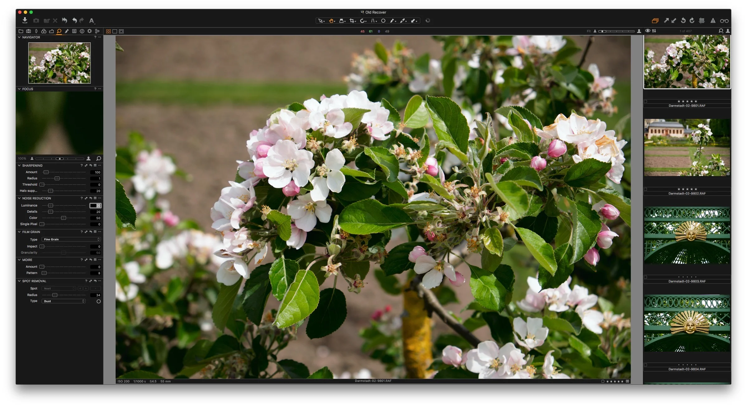
Yesterday Phase One released a new update to their Capture One Software. Despite being just a point release, it is actually a pretty significant update. It contains a number of very important feature changes. If you’re a Fuji X-Trans shooter, the software also includes some big changes to X-Trans support too. I’ve actually been using the beta version of 10.1 and I’m excited now that it is finally released and I can talk about it. There are three major changes that I want to talk about in this post.
X-Trans Support
Phase One describes the X-Trans support in this releaser as being “re-designed” and I think that pretty much says it. In addition to adding support for compressed RAF files (finally) the software also adds additional features such as Chromatic Aberration analysis, and few other things. However, I think it actually goes a bit deeper than that.
To my eyes, X-Trans files look different in this new version. They appear sharper and more detailed by default, and even if you turn sharpening off, the files seem to have a different look to them. They are also, unfortunately, a bit nosier. My guess is that a new decoding engine is being used. On the plus side, I think that the files look great in the new version, but you will need to add a bit more noise reduction than you would have in previous versions.
Because of the changes here, I have delayed my rebooted guide so that I can make sure that I have the optimal settings for working with X-Trans files in 10.1.
Before and After
This is one of those things that I’m amazed it took so long for Phase One to implement in the software. It was one of the biggest frustrations that I had wth it for a long time. You could always see a before and after view of individual adjustments by hiding down the alt / option key and clicking and holding on the reset icon on the individual adjustment panels, however there was no way to do a before and after on a full image. The manual suggested that you create a new variant in order to do this.
Anyway, they have finally implemented a before and after toggle, although it’s in a slightly different way than you might expect if you’re used to working wth other applications. To do a before and after view, you need to hold down the alt / option key while clicking and holding on the master reset button. When you release, it will go back to your adjusted version. Just make sure to hold down the option key or you will reset your image. If you don’t see this button on the interface, it may be because you’ve updated from an old version and its still using the old UI layout. Just reset the layout by selecting “default” from the workspace menu.
New Styles and Presets Layout
If you used lots of Styles and Presets in Capture One, the interface for applying them could be a bit frustrating. It relied on a series of nested submenus, which was a real pain if you had a lot of styles. In the new version, they have completely changed the interface, and now it is much better.
The styles and presets are now in a list, in a series of collapsible sub sections. This is now much the same way as Lightroom’s develop presets interface works, and it makes it much easier to find, preview and apply styles. It is a huge improvement, and if you’ve installed a good few styles, this should make it much easier to find and apply them.
A few other things of note
When using the beta I noticed a few other things that aren’t specifically mentioned in the release notes, but are worth mentioning. It could well be that some of these things are just my imagination, but here are some of the differences that I’ve observed:
Overall Speed: The application seems to be much faster now, especially when working with X-Trans files, but even on other raw files the general speed increase seems to be quite noticeable, in my opinion.
Previews are sharper - sort of: Again, I can’t say this for certain, but preview new seem sharper to me than in the previous version. In 10.0 they were a little soft, even if you increased the preview resolution. Now they seem much sharper again. I did notice some weirdness regarding previews in the beta, but in the final release it seems that they have made them sharper again. However, vertical images still appear overly soft, and they almost look like they have camera blur or motion blur applied, when they don’t. It’s subtle, but it’s still quite noticeable in my opinion. You may find that if you upgrade your catalogue, it will try to regenerate previews for existing images.
I’m not really sure if the result is better though. Its the one area with Capture One that I have an issue with (I’ll continue this rant in the conclusion!). I find that the previews can make the images look a bit harsh and grainy, even if they’re not. Whatever algorithm is being used to scale the results down for screen, the results aren’t as clean or as natural looking as Lightroom. This is of course just my opinion, but it’s something that I find mildly frustrating about the software.
Some tips for updating
If you’re updating from a previous version then there are a few things that you can do to make your experience go a bit smoother.
- Back up your catalogue. If you have the space, you really should back up your catalogue before upgrading it. In the past I’ve found that upgrading caused a problem and rendered my catalogue unusable. (luckily I had a backup)
- Create a new catalogue, and import your old one. If you want a completely clean and fresh catalogue, there is a trick that you can use, that I’ve read a few people do with Lightroom for major versions, and you can do it in Capture One too. Start by creating a new catalogue, and then import your old one. It will import everything from folders to albums and it should keep everything intact, but if there is any spurious errors in your old catalogue this should get rid of them. I found this method saved my work at one point, when my catalogue was corrupt. I couldn’t open it, but I was able to import it into a new one.
- Reset your interface. I’ve found that sometimes new features get added and if you have made your own UI changes you may not see them, as they aren’t easily addable by hand. So, whenever there is a new major release, I like to go back to the default workspace. This makes sure that any new features are added to the interface. I know this can be a pain if you have a highly customised interface, but it’s not going to delete it, so long as you have saved your custom workspace. So you can use the default to identify any new updated features, and then try and update your own custom one.
Conclusion
I have to hand it to Phase One for aggressively developing Capture One. I suspect that they sense an opening caused by the general dissatisfaction with Lightroom doing the rounds. They are constantly updating and improving it, and appear to be actually listening to their customers. Adobe on the other hand, despite saying that the subscription model will make it easier for them to put out new releases and new features, has been glacial with regard to Lightroom features, and the current version is still technically “2015”.
Despite this, I don’t use Capture One full time. There are still some minor things that I find frustrating with the software, but with every release, more and more of those things are getting addressed. Lightroom on the other hand seems to get buggier with each version. If you look on the adobe forums, the kinds of bugs people are reporting are completely ridiculous, and I’ve had nothing but trouble lately too.
My single biggest issue with Capture One is the way it handles previews. This may sound really picky, but I’ve found that whatever they’re doing it can make images look bad, and I have a tendency to skip over images that I would otherwise use. I can’t out my finger on what it its about the previews that I don’t like, and I know it’s probably just me, but whatever method they’re using for generating a display image, it could do with some improvements. It also doesn’t render everything either. As far as I can tell, purple fringing correction isn’t rendered properly. Also, vertical images appear much softer than horizontal images and much softer than they would in Lightroom.
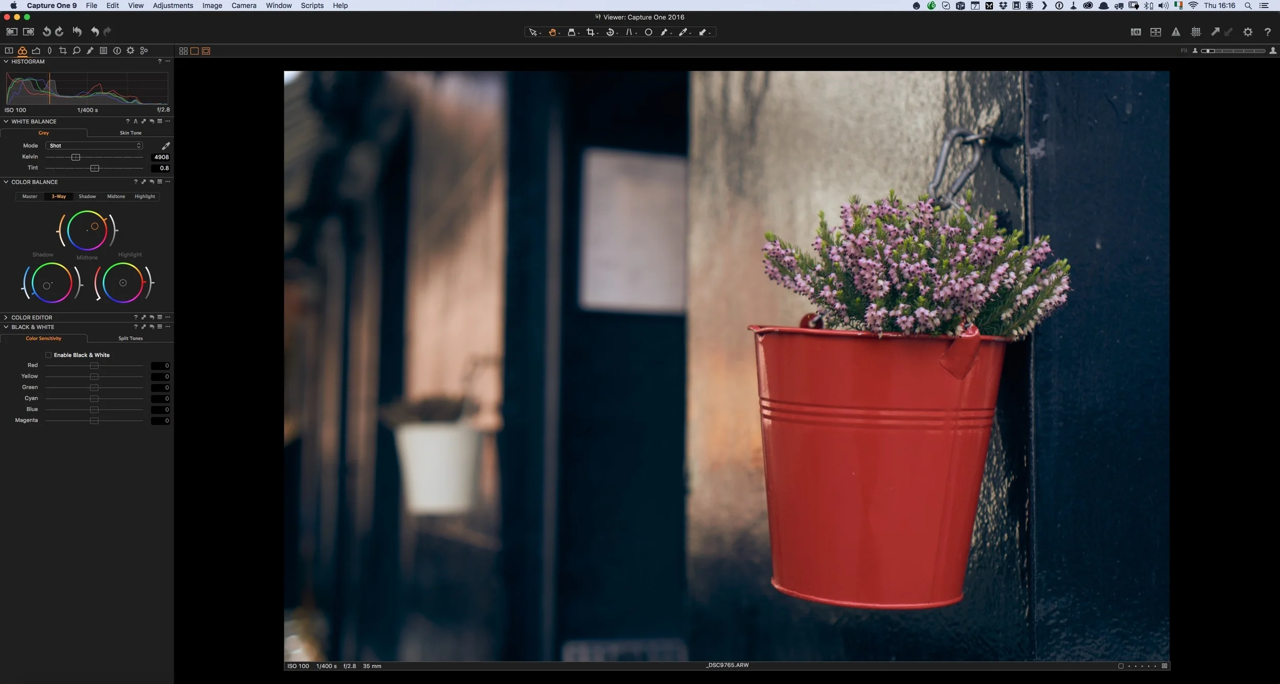
Click to view large so that you can see the difference. Right click and choose open link in new tab to see fully if the lightbox is too small.
Again, this may seem like I'm being really picky, and I’m not really describing this very well, but I think that properly displaying an image should be important. At the moment, it’s just an approximation. Other than that though, its hard to fault it, and it gets better and better with every release.
Help Support the Blog
If you like this post then you can see more of my work on Instagram, Twitter and Facebook. I also have a YouTube channel that you might like. You should also check out my other Photography Project: The Streets of Dublin. If you want to get regular updates, and notices of occasional special offers, and discounts from my store, then please sign up for the Newsletter.
All of the work I do here, and the information on this blog is done entirely free of charge and takes quite a bit of work. I want to spend more and more time on this blog, and offer more and more of this kind of information, tips and so on. All of this is funded exclusively through my Digital Download store, so If you like what I'm doing here and want to show support, then you can do so by buying something from my Digital Download Store where I have Lightroom Presets, and e-books available for download.
If you're a Fuji X-Trans shooter and Lightroom user, check out my guide to post processing X-Trans files in Lightroom. I also have a guides for processing X-Trans files in Capture One and Iridient Developer.
For Sony Alpha shooters I have a new guide with tips on how to get the best from processing your A6000 Images in Lightroom.


