White balance and its importance - An Excerpt from my Sony A6000 Guide
This is an excerpt from my Sony A6000 post processing guide for Lightroom. While this was written specifically for the A6000 the tips here are relevant for users of any camera.
It may seem like a simple thing, but getting the correct white balance can have a significant impact on the overall look of an image. Often you may hear people complaining about the colours of a particular camera, and that they don’t like the colours that a specific brand of camera might produce. It is a common misconception that this has to do with the design of the sensor. In many cases much of what is perceived as differences in a camera’s ability to capture colours may be partly due to the way a camera’s white balance is calibrated.
Different cameras from different manufacturers used different algorithms for their white balance calculations. When you set your camera’s white balance to automatic, the camera uses its internal computer to calculate the best white balance based off what its sensor sees. Because different cameras use different computations, taking the same image on two different cameras can often result in different colours. Even when you set the white balance manually using one of the available presets on your camera, these too can vary from camera to camera. While a cameras “colour” isn’t entirely down to the white balance used, it can be a big part of it.
When you shoot RAW, the value that you used when shooting in the camera is recorded with the RAW file as metadata, but the actual white balance isn’t baked into the file as it would be with a JPEG for example, so you can adjust the value afterwards.
To make matters even more complicated, different RAW converters interpret this value differently, so opening the image in Capture One for example, might report a different value for white balance than opening the same image in Lightroom. You might also see a subtle difference in colour.
All this is quite technical, but you don’t really have to worry about it. It’s just useful to understand what’s going on behind the scenes so that you can be better informed when you approach tweaking your white balance.
Adjusting the white balance in Lightroom
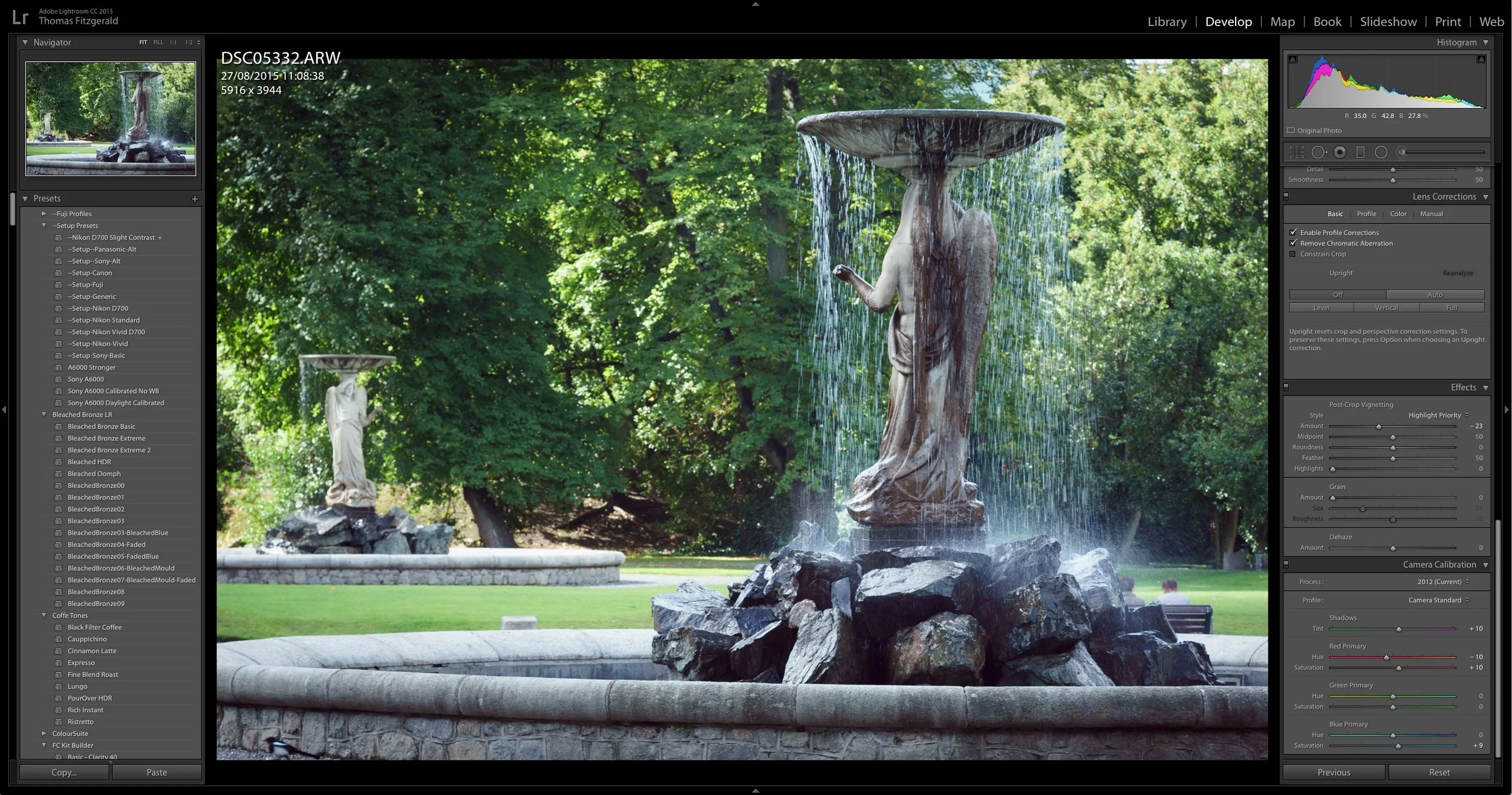
The chances are you know how to adjust the white balance of your image in Lightroom. You just drag the white balance slider, right? Well, yes, but there are some things to be aware of that can help you get better results, especially when working with images from the A6000. Here are a series of tips that will make your life a little easier when working with A6000 RAW files:
Small increments can make a big difference
Adjusting your white balance in small increments can make a big difference. Sometimes it’s actually quite difficult to use the sliders to do this, so entering values numerically can actually help. Try making changes in values of 50 and seeing the difference it makes. Once you get used to the values that work for you, you can enter them numerically from then on, or use presets to save your favourite settings.
Don’t forget the tint control
One of the things that some people often forget to do is use the tint control when adjusting the white balance of images in Lightroom. The tint can actually make a big difference. If your image looks a little green or if the yellows look a little off, then moving the tint slider towards the magenta side might help. Similarly if your image looks a little too purple then sliding it back towards green can help. As with the temperature slider, even small adjustments can make a difference. Sometimes the effect may be subtle, but the overall result makes your image look more natural.
Before White Balance Adjustment
After White Balance Adjustment
Tinting shadows and highlights
Sometimes you may be with the overall balance of your image, but you may find that the shadows are a little warm or cool, or that you want to add some warmth to the highlights. Another issue that can occur is that there is a purple tint to the shadows. You may also want to creatively adjust the shadows and highlight tones.
There are three ways to go about adjusting the shadows, and two ways to adjust the colour of the highlights. First let’s look at one of the ways to adjust the shadow tones, and this way is specifically useful if your image has purple shadows.
Fixing purple shadows
If your image suffers from purple shadows, fixing it in Lightroom is actually quite easy. It involves using the same calibration controls that we used in the previous chapter when adjusting the calibration.
To change the shadow tinting, use the Shadows slider in the Camera Calibration panel. If your image has a purple tint to the shadows, dragging the slider to the left, towards the green side will remove this purple tint in the shadows.
If you have already used the suggestions for changing the calibration earlier in this guide, then you can still adjust the Shadows slider for individual images should the need occur.
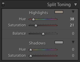
Using the Split Toning controls.
You can also add a degree of tinting to the shadows and highlights of your image by using the Split Toning controls. While the split toning controls may be traditionally associated with black and white images, the settings actually work with colour photos too. By adding a colour tint using these controls, you can independently tint the shadow and highlight portions of your image separately.
There are a few downsides to this method however. For a start, while it will tint the shadows, it may apply some tinting to the mid tones as well. Secondly, while it is a useful addition to your creative arsenal, there are limits to what you can do with these controls. Having said all that, careful use of split toning can be useful in both a creative way, and to fix potential issues.
Using the split toning control is actually quite simple. You select the colour you want to tint the shadows with, and then you have a Saturation slider to control the intensity. The same applies to the highlights. An additional slider provides a balance between these two. Think of it as controlling the mid point. Here’s a step by step guide to using the controls:
- Go to the Split Toning Panel in the Develop module.
- Start by setting the Highlights colour. There are two ways to do this:
You can click on the colour swatch which will bring up a colour picker. This will let you pick a colour with which to tint the highlights of your image. The “S” slider in this colour picker stands for saturation. The saturation slider will control the strength of the tinting. Alternatively, you can select a colour using the Hue and Saturation sliders in the Split Toning panel. As with selecting the colour using the colour picker, the saturation slider controls the intensity of the tint. - Repeat this process for the Shadows section.
- You can control the balance between the two by using the Balance slider. Sliding towards the left will put more emphasis on the shadow tinting. In other words it will increase the level of tinting in the shadows and reduce the level of tinting in the highlights. Dragging it to the right has the opposite effect.
- You don’t have to tint both the shadows and highlights. You can just do one or the other. Just make sure that the saturation slider for the one you don’t want to use is set to zero. Additionally, if you’re just using the split toning controls to just tint either the shadows or the highlights, you can use the balance slider as a sort of volume control for the effect. By dragging it away from the side that you are using (left side is for shadows, right side is for highlights) you can reduce the effect. For example, if you’ve tinted the shadows, then dragging the balance slider to the right (away from the shadows side) will reduce the tinting in the shadows.
Adjusting the Highlights of the Split Tone
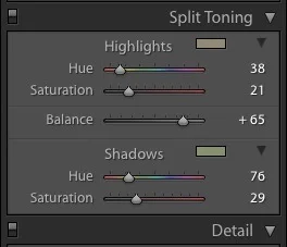
Adjusting the Split Tone balance
This is just a small section of what I covered on this topic in the Sony A6000 guide. I also covered how to tint parts of an image using curves, and how to set a white balance offset on the camera. If you’re an A6000 shooter and want to get more from your camera’s images in Lightroom, then check out my A6000 post processing guide.
PROCESSING SONY A6000 RAW FILES IN LIGHTROOM: WORKFLOW AND SETTINGS GUIDE
€5.00 Currently On Sale at...€4.00 Incl. Vat
The A6000 is one of Sony’s best selling mirrorless cameras, even with its successor the A6300 now in the market. While working with Sony RAW files in Lightroom may seem like a fairly straightforward process, there are lots of things that you can do to optimise your workflow. This guide will look at all these things, and give you the knowledge you need to get the best from your Sony RAW files, no matter what the situation.